

Licensed, Bonded & Insured | WA Contractor License #NEXTSSP812L1


Revitalize Your Home
Trusted Painting Contractor Near You In Bellingham Washington
If you’re looking for a dependable painting contractor in Bellingham Washington, Next Step Painting is the local painting company homeowners trust for quality and reliability. We understand the unique weather conditions in Bellingham and use proven techniques to ensure long-lasting, beautiful results. Whether you need interior updates or exterior protection, our team is committed to delivering clean workmanship, clear communication, and a smooth experience from start to finish.


Detailed Prep Process
Thorough preparation helps ensure a smooth application and long-lasting paint performance.

Premium Materials
We select high-performance paints designed to withstand Bellingham’s climate.

Quality You Can See
We deliver neat finishes and professional results that enhance the look of your home.
Testimonials
Hear from Our Satisfied Clients
Homeowners throughout the community share their experiences working with Next Step Painting and the quality results our team delivers. As a trusted Bellingham Washington local painting contractor, we take pride in providing reliable workmanship and a smooth experience from start to finish.

Request a FREE Quote
(360) 255-3183
Why Homeowners in Bellingham Choose Us
Quality Painting Solutions for Every Property in Bellingham
Homeowners in Bellingham choose Next Step Painting because we focus on delivering dependable results and a smooth experience from the first consultation to the final walkthrough. As a trusted painting contractor in Bellingham Washington, our team understands the local climate, the styles of homes in Whatcom County, and the importance of using the right preparation and materials to achieve long-lasting finishes. Many residents searching online for a painting contractor near me in the area choose our team because we consistently provide reliable service and attention to detail.
As a professional painting contractor, we bring experience, skill, and dedication to every project we take on in the Bellingham community. Our team works as a dedicated residential painting contractor committed to improving the appearance and value of local homes. When you hire a home painting contractor, you want a team that treats your property with care and delivers results that last. We provide residential and commercial painting services designed to enhance properties throughout Bellingham. Homeowners trust our home painting services in Bellingham WA because we focus on craftsmanship, reliability, and customer satisfaction on every project.
Request FREE Quote


Pressure Washing Services
Professional Exterior Surface Cleaning
Restore the clean appearance of your home with professional pressure washing. Our team removes dirt, algae, mildew, and grime from siding, driveways, decks, and walkways. Regular exterior cleaning helps maintain curb appeal and keeps your property looking fresh throughout the Pacific Northwest seasons.
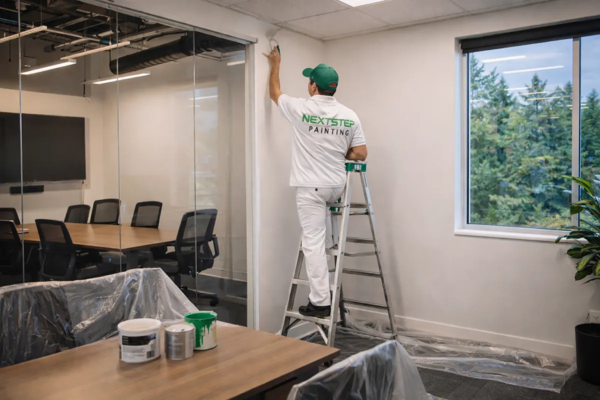
Our Painting Services
Skilled Painting Services You Can Trust
Residential Painting
Our residential painting services help homeowners refresh and protect their homes. As a trusted Painting Contractor in Bellingham Washington, we deliver clean finishes that enhance the look and value of every home.

Commercial Painting
Our commercial painting services help businesses maintain a professional and attractive appearance. We work efficiently to deliver durable finishes that enhance the look of your property while minimizing disruption to your operations.
Revitalize Your Home
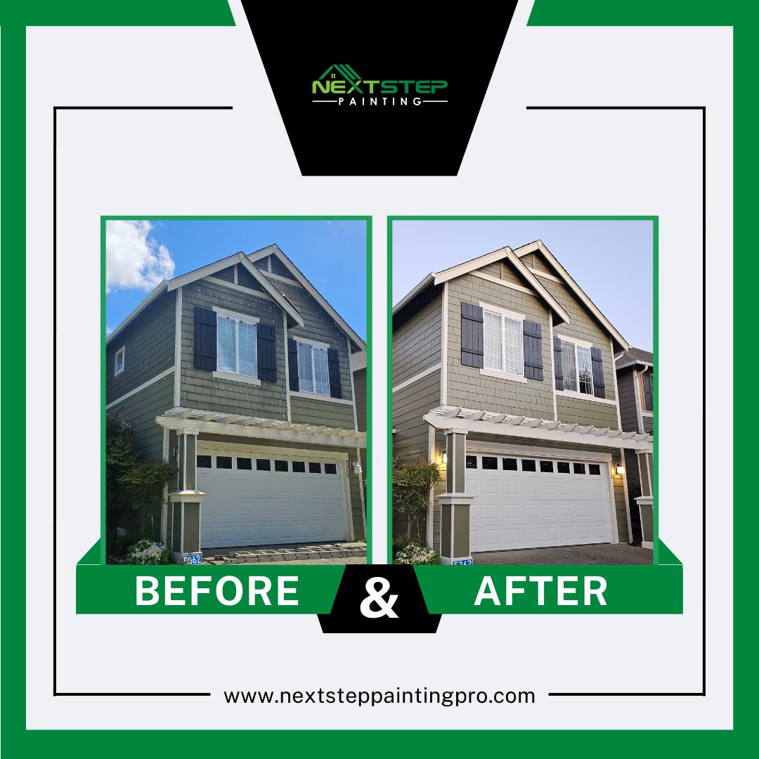
Our Work Portfolio
Professional Painting Results from Local Projects
Our work portfolio highlights the craftsmanship and attention to detail our team brings to every project. As a trusted local painting company, we take pride in transforming homes throughout the Bellingham community with clean finishes and reliable service. Each project reflects the care and precision we deliver with our professional house painting services.


Climate-Smart Painting for the Pacific Northwest
Long-Lasting Paint for Bellingham Homes
Homes in the Pacific Northwest require painting solutions that can handle constant moisture, seasonal temperature shifts, and coastal air. As a trusted Bellingham Washington local painting contractor, our team understands how the regional climate affects exterior surfaces and finishes. Proper preparation, weather-resistant coatings, and experienced application techniques help protect homes while keeping them looking beautiful throughout the year.
Many homeowners searching online for painting services near me in the area want results that last in Bellingham’s unique environment. As a reliable house painting company, we focus on selecting materials and techniques suited for the local climate. Our team also provides indoor painting services that refresh living spaces while maintaining clean lines and durable finishes. With our dependable Bellingham WA local painting services, property owners receive solutions designed specifically for the Pacific Northwest. As a professional painting company in Bellingham WA, we are committed to delivering results that improve both protection and curb appeal for local homes.

Climate-Smart Painting for the Pacific Northwest
Durable Paint Finishes for Coastal Conditions
In the Pacific Northwest, paint must perform well against frequent rain, humidity, and shifting temperatures. At Next Step Painting, we apply proven methods suited for the region so finishes stay strong and visually appealing over time. Many property owners searching for home painting services near me in Bellingham rely on our team for knowledgeable recommendations and skilled application designed specifically for local homes.
Frequently Asked Questions
Your Painting Questions Answered
How much does it cost to paint a home in Bellingham, WA?
The cost to paint a home in Bellingham, WA depends on factors such as home size, surface condition, paint type, and project complexity. Exterior projects may require additional preparation. Many homeowners searching for a painting company near me request a personalized estimate to get accurate pricing based on their property’s condition and painting needs.
How long does exterior paint last in Washington?
Exterior paint in Washington typically lasts about 5 to 10 years, depending on surface materials, paint quality, and exposure to rain and moisture. Regular maintenance and proper preparation help extend the lifespan of the finish. Homeowners searching for residential painting services near me often schedule inspections to keep their exterior paint looking fresh and well protected.
Are you licensed and insured in Washington State?
Yes, we operate in compliance with Washington State regulations and maintain the appropriate licensing and insurance required for painting contractors. This helps protect both our team and our clients throughout every project. Homeowners can feel confident knowing their property is handled by a responsible and properly covered professional painting company.
Do you offer free estimates?
Yes, we offer free estimates for our painting services. Our team will review the details of your project, evaluate the surfaces, and discuss your goals to provide an accurate quote. This allows homeowners to understand the scope of work and pricing before scheduling their painting project.
Get In Touch
Ready to refresh your home or business
Contact Next Step Painting today for a detailed, no-obligation estimate.
Service Areas
Licensed, Bonded & Insured
Our Services
Business Hours
Mon - Fri
Saturday
Sunday
9:00 - 6:00 pm
10:00 - 5:00pm
Closed


© 2026 Next Step Painting - All Rights Reserved.